Catalogue element
bry-item
One thing that stands on its own (a setting, a linked account, a file to act on): an icon, a title and a line, with its children as actions at the end.
Settings
| Setting | Takes | Needed |
|---|---|---|
title | text, at most 200 characters | no |
description | text, at most 200 characters | no |
icon | add, archive, calendar, check, copy, dismiss, docs, info, mail, members, notes, pin, rename, retry, search, settings, tasks, trash, account, activity, attach, bell, boardLayout, box, branch, calendarRange, channel, chart, cycle, download, externalLink, flag, ganttLayout, history, home, inbox, layers, link, listLayout, lock, maximise, panelRight, pause, play, progress, project, relation, sliders, tableLayout, tag, target, temporary, userAdd, status, filter, stateReview, swimlaneLayout | no |
variant | default, outline, muted | no |
size | sm, md | no |
pressable | true or false | no |
loading | true or false | no |
Example
JSX
<bry-stack gap={"2"}>
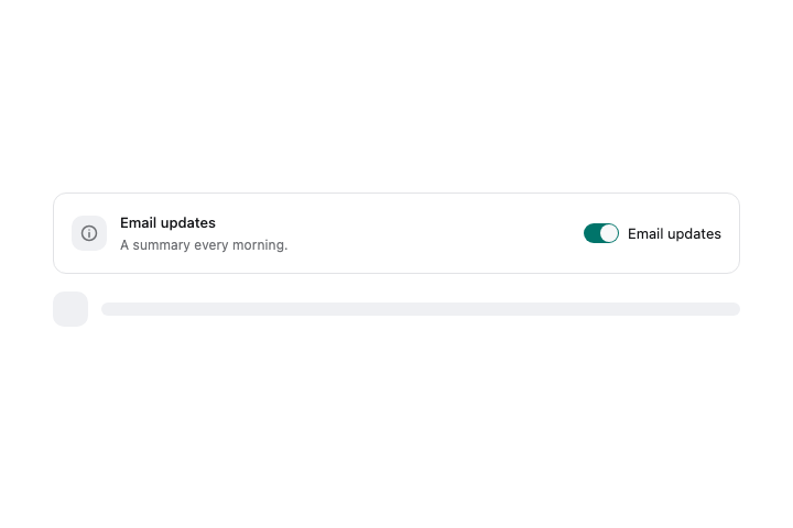
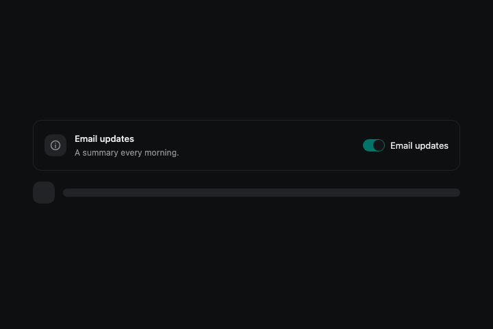
  <bry-item title={"Email updates"} description={"A summary every morning."} icon={"mail"} variant={"outline"}>
    <bry-switch label={"Email updates"} checked={true} />
  </bry-item>
  <bry-item loading={true} />
</bry-stack>
Renderer contact sheet
These paths will hold the checked light and dark captures.